Home Decor · 6 min read · 18 June 2026
Bedroom Colour Schemes That Help You Sleep (2026 Palettes)
The bedroom is the one room with a job description: rest. The palettes that serve it, the ratio that organises any scheme, and the colours that fight sleep.
By the Nims Casa editorial team — written from professional cleaning experience and checked against our editorial standards.
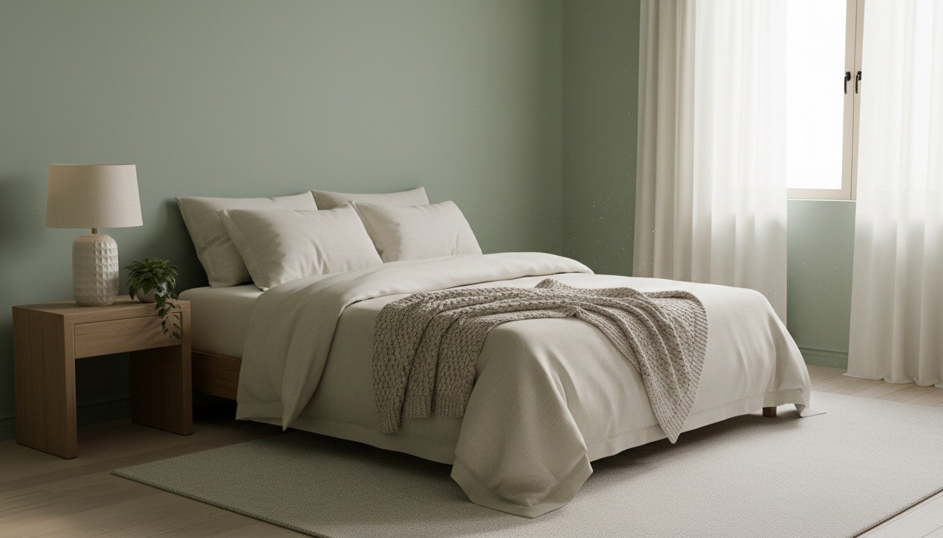
Every other room in the house is allowed to chase drama. The bedroom has one job: help a nervous system wind down enough to actually sleep. That doesn't mean beige is compulsory — it means muted. Colours with the volume turned down, warm rather than cold, matte rather than glossy. Within those limits, the palettes working in UK bedrooms for 2026 are genuinely lovely, not a consolation prize for giving up on colour.
This guide covers the colour families flattering UK light right now, the 60-30-10 rule that stops a scheme looking assembled, a step-by-step way to choose your own palette, realistic tester and paint costs, common mistakes, and the colours worth keeping to accents only.
None of it needs a full redecoration budget. A tester pot and a Saturday afternoon will tell you more than any colour chart.
The Bedroom Palettes Working in UK Homes for 2026
Five palette families keep recurring in UK bedrooms this year, each solving the same brief — restful, warm, matte — a slightly different way.
- •Warm plaster neutrals: clay-pink, oat, mushroom and putty — cocooning without the chill grey brought to the 2010s bedroom. A 2.5-litre tin of matt emulsion runs £28-£45.
- •Muted greens: sage through olive to a deeper bottle green on woodwork. Green is the closest thing colour psychology has to consensus on restfulness, and flatters both oak and painted furniture.
- •Dusty, greyed blues: classic sleep territory, kept warm rather than cold. Pair with cream trim rather than brilliant white so the room doesn't read cold under grey UK skies.
- •The enveloping dark: inky green-blue, aubergine or soft black on walls and ceiling in one continuous colour, for small rooms that want to feel like a den. Brass and wool keep it hotel rather than cave — a small-room version of the wider colour drenching trend.
- •Terracotta or warm rust as an accent wall only, paired with oatmeal bedding — too stimulating as a full scheme, but excellent at accent scale.
- •Whatever's on the walls, keep bedding predominantly pale and natural. The bed is roughly 30% of a bedroom's visible colour, and crisp bedding sells the whole scheme.
How to Choose Your Bedroom Colour Scheme, Step by Step
Copying a palette from a photograph rarely survives contact with your actual room, because light, aspect and existing furniture change everything.
- •Establish your room's aspect first. North-facing bedrooms lose warmth fast, so lean into oat, clay-pink or warm sage; south- and west-facing rooms can carry cooler, greyer tones without feeling clinical.
- •Buy three or four tester pots (£3-£6 each), not one — you need a genuine choice, not a single colour you're hoping to like.
- •Paint sample squares of at least 40cm on two walls, including the darkest one, and live with them for a week, including one grey morning.
- •Choose your dominant colour first, then work outward using the 60-30-10 rule below, rather than picking three colours you love independently and hoping they cooperate.
- •Check the colour against existing wood tones under daylight and your actual bedside bulb, since warm- and cool-white LEDs shift a colour noticeably.
- •If you're renting, test with removable options first; our rental-friendly decor guide covers what's reversible. Once you commit, read up on painting a room properly so prep doesn't undo a good choice.
The 60-30-10 Rule: Balancing Colour So a Scheme Feels Designed
The 60-30-10 rule is the simplest way to make a bedroom scheme look intentional rather than assembled. Sixty per cent of visible colour — walls, and in an enveloping dark scheme, the ceiling — carries your dominant tone. Thirty per cent, secondary, lives in bedding, curtains and a rug, complementing the walls or a shade lighter. The remaining ten per cent is accent: cushions, a lamp, artwork — for anything too bold to commit to at wall scale.
Get the ratio wrong and even good colours fight each other; three colours each competing for a third reads as clutter, however nice each is alone. If you're unsure which family suits your room, our guide to choosing an interior design style matches palette to room shape.
Paint, Testers and Sample Costs: What You'll Actually Spend
A bedroom colour scheme is one of the cheapest transformations in the house, provided you budget for testing properly rather than skipping to the big tin.
- •Tester pots: £3-£6 each; budget for three or four colours minimum.
- •Sample boards or lining-paper offcuts to test on, rather than painting a rented wall directly: free to £5.
- •Matt or eggshell emulsion, 2.5 litres: £28-£48, depending on brand and whether it's low-VOC.
- •A decent brush and roller set: £15-£25 — a cheap roller leaves a stippled texture that shows under a bedside lamp.
- •For woodwork, eggshell survives daily contact better than a fully matt finish; see eggshell vs satin paint for which belongs where.
- •A full bedroom (average UK double, walls only) needs two coats from two to three tins, so budget £60-£140 in paint; for exact coverage, see how much paint you'll need.
Colours That Fight Sleep — and What to Use Instead
Bright red and orange are arousal colours, associated with raised heart rate and alertness — exactly backwards for a room whose job is calming a nervous system down. Use them only as a 10% accent, never a wall colour. Brilliant white throughout reads clinical rather than calm under UK artificial light, particularly cool-white bulbs, and shows every scuff. High-gloss finishes bounce streetlight and headlights across the ceiling all night in a way matt paint simply absorbs. Matt and eggshell remain the bedroom's finish family for good reason.
Common Bedroom Colour Mistakes to Avoid
Most disappointing bedroom schemes fail for one of a handful of repeatable reasons.
- •Testing colour on a sunny afternoon only, then living with a different-looking colour every grey morning and every evening under lamplight.
- •Choosing wall colour before checking it against a wardrobe or floor you're not replacing — clashing undertones are more common than clashing colours.
- •Painting a small room in three or four colours instead of one confident colour carried through, including the woodwork.
- •Ignoring storage in the plan entirely. An overstuffed wardrobe undoes a calm palette, so a proper wardrobe organisation sort-out belongs on the same to-do list as the paint.
- •Buying the big tin before the tester pot — a colour that looked perfect on a chip rarely survives full-wall scale unchanged.
When to Call a Colour Consultant or Decorator
Most bedroom colour decisions don't need a professional — testers and patience get you there. It's worth calling in a decorator or colour consultant when you're colour-drenching an entire room and want certainty on quantities and sheen before committing, when matching a new scheme to fixed built-in furniture or a period fireplace, or when awkward angles like a dormer ceiling make a DIY 60-30-10 split hard to visualise. A basic consultation runs roughly £80-£200 for a couple of hours; if you're having the painting done professionally too, see typical interior painting costs.
Frequently asked questions
**What's the best bedroom colour for sleep?** No single colour is definitively best, but muted, warm, matte colours — sage green, dusty blue, warm neutrals — consistently outperform bright or cold ones by lowering visual stimulation. Personal association matters too: a colour you associate with calm beats a technically 'correct' one you dislike.
**Should the ceiling match the walls?** Only in an enveloping dark scheme, where matching colour removes the visual 'stop' a ceiling line creates, which can make a small room feel larger. In a paler scheme, a lighter ceiling keeps things feeling open.
**What colour makes a small bedroom look bigger?** A single confident mid-tone carried onto the woodwork often reads larger than pale walls with contrasting white trim, because the eye stops cataloguing edges.
**How many tester pots should I buy?** Three or four minimum, tested on two walls including the darkest one. A single pot gives no comparison and no way to judge a warmer or cooler alternative.
**Do dark colours make a small bedroom feel smaller?** Not necessarily. A dark colour carried consistently across walls, ceiling and skirting removes corners for the eye to measure by, which often reads as cocooning rather than cramped.
Found this useful?
There's plenty more — hundreds of guides and honestly-tested product reviews for every corner of your home.
Browse All Guides